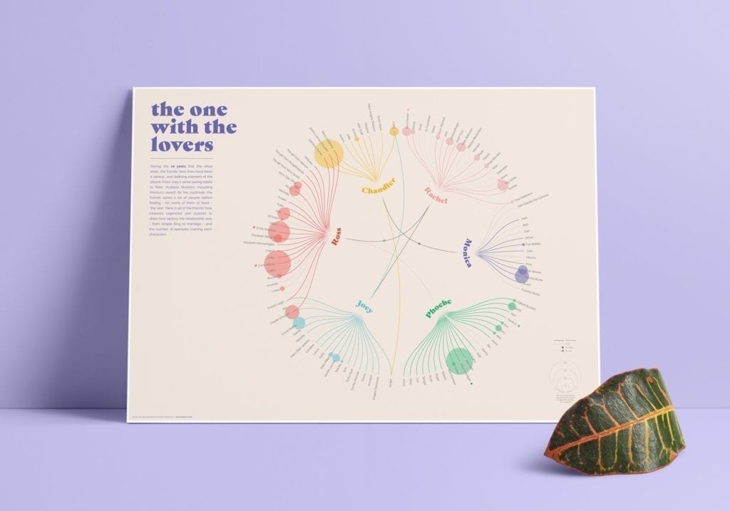
An infographic is a visual way of presenting data. As data is often very dry and hard to consume in large quantities, infographics have risen in popularity over recent years.
When they’re done well, infographics are highly shareable and a feast for the eyes. So you can see the appeal they have, particularly for businesses that don’t work in the most exciting of industries.
However, I’m now asking whether they’ve had their time. Has the moment come for them to be put on the scrapheap for good?
Infographics and their misconceptions
The main problem I have with infographics is that they’re everywhere.
Over-done, poorly-done, and too text-heavy: the internet is littered with dead “infographics”. I use this term loosely because some provide you with no new information and are barely a graphic. But is this just because, as with anything that becomes a bit of fad, there are always those that are done poorly?
I’d be more willing to bet that it’s because the concept of an infographic is frequently misunderstood.
Whilst an infographic is a format, it’s not one you can mould to any topic. Some data works really well visually; statistics do really well in visual formats. However, more and more infographics are straying from presenting data. Instead of telling a short story, they’re trying to cram a full-length novel into paragraphs of text. If you need that many words, why are you trying to squash it into a visual format? And if you don’t need that many words, get editing.
Complex topics can be broken down if the copy is amazing. But condensing complex things down into bite-size chunks is hard work, even if it doesn’t look like it by the time there are only 100 words left on the page. The clean, simple look of an infographic – its biggest selling point – is the hardest to achieve. That’s why so many are done badly because whilst they look easy to execute, they’re far from it.
The problem is that because they look simple, they don’t require much substance. You only need 100 words for it, so a copywriter can bang that out in 10 minutes, surely?
But hold your horses!
Topic + format ≠ idea
Just wanting to make an infographic doesn’t make it an idea. Even having a topic such as “digital marketing” isn’t an idea. So if you create infographics without a solid idea at its core, you can tell a mile off. How? Because it doesn’t actually tell you anything. It’s just words. It feels like it’s content made for the sake of having content.
If you don’t care about it, I can assure you, no one else will. You can tell immediately if it’s been made with no passion or thought. Even if it looks cool, the design can only carry it so far. You need a strong idea to hold the whole thing up, or it’ll come crashing down with the first slight breeze.
Once you have a strong idea, use it wisely. We all know the best ones are like gold dust. So don’t waste it on an infographic just because you started out wanting to make an infographic. You should use the format that will make the idea shine the brightest.

A shift in focus
Infographics were good when they were at the forefront of creative content. But they’ve now been overtaken by the likes of interactives. It’s similar to what a photograph is to a film – it just gives you more.
So if you’re still making bog-standard graphics then it’s a quick way to look like your getting left behind. Infographics still have their place, they’re just overdone. As a result, they’re not the big impact pieces that they were when they were shiny and new. They’re a commonplace format now that hold no surprises. Your content has to work hard to engage people, rather than relying on an ‘interesting’ format to grab attention.
There are more and more tools out there designed to make content creation easier. Video, for example, is more accessible than ever before. You can film great-quality footage on an iPhone. Again, all the focus is on the idea itself. The execution isn’t as long-winded or expensive as it once was. Content can now be produced by pretty much anyone, so the battle is on for originality – something which the infographic limits purely because of the boxes you have to tick to make it work.
What does the future hold for infographics?
The infographic is being crushed to death by the sheer volume of them out there. But this graveyard is the perfect setting for a resurrection. How does it rise from the ashes?
For starters, save it for special occasions. An infographic is not an article. It’s not a video. It’s their slightly-overweight older brother – not as versatile. So make sure the idea you have really works for an infographic and wouldn’t be better suited to another format. This way, we’ll stem the flow of bad ones that are being churned out.
Secondly, when you do make one, do it so well that no one even puts it in the same bracket as infographics. You want people to dive straight into the journey your infographic takes them on before “not another one of these” even crosses their mind.
It’s not the format I take an issue with. Infographics can be visually amazing and a great way of concisely getting a message across. The brain processes visual information a lot quicker and retains it much easier. For this reason, infographics are worth the time and effort needed to get them right.
But please, stop beating infographics to death with terrible content.


