The main aim of a PPC campaign is to drive results and gain conversions for your business. A good conversion rate means more sales and revenue, which helps pay for your PPC advertising budget. If your landing page is difficult to navigate, or users find themselves looking at a page they didn’t expect to land on when they click on your PPC advert, they will not convert. Our latest article looks at how improvements to your landing page will benefit your PPC performance.
The Key to Customer Acquisition
A focused, well-designed landing page is the key to gaining customers and converting users from your PPC campaigns. We’ve spoken before about how to create the best landing page for your adverts. However, its’ not just about the creation of that single page. Landing pages are designed to convert your customers, and you should have everything you need on that page so they can do this in a single click. Though, if a user wants to find out more about your business and services by navigating throughout your site, make sure they can do that with ease, and your site flows well.
User Experience and Conversion Rate Optimisation
A user is more likely to convert on a page with a good user experience. This includes how they feel when they land on a page, if they find the page easy to understand, if they can find everything they expected to find on the page and if it’s easy to make contact or buy the product they wanted from the page.
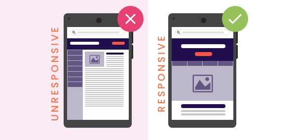
Many things can hinder user experience, such as slow loading speeds, a disjointed layout on mobile or tablet devices, uninspiring content, lousy navigation, unclear CTAs and more. Issues like these can crop up at any time due to theme updates, new form implementation or plugin changes, so it’s a good idea to check your landing pages frequently. If your landing page looks good when it was created, it might not look the same 6 months down the line. Here are a few tips for checking your landing pages’ user experience.
How to Check The User Experience Of Your Page
One of the simplest methods of checking user experience is by going on the page. Put yourself in the shoes of your prospective customers. Think about what has made them click onto your site, what they are looking for and how they can get it.
Navigate the landing page as if you are them, and test that the forms work and that there are no blocks to get to where you expect them to get to. Check that the rest of the site is accessible too. Then do it again on different devices. There are tools like Screenfly, which will allow you to see what a webpage or a site looks like on other devices if you don’t have access to many yourself.
Of course, when you work on a website every day, it’s easy to know where to go to find certain things. So testing the site yourself doesn’t always work. How you navigate the page may differ from how your target personas might navigate. It’s a good idea to have these personas in mind and try to think and act as they would.
Check The Activity of Real-Time Users To Your Site
Alternatively, if you have the time and budget, you can set up a recording for your site to actively see how people find the experience when they land on the page. This is an excellent idea for landing pages connected to adverts with a high click-through rate but few conversions.
Using software like Microsoft Clarity or Hotjar allows you to witness exactly how people interact with your website. It can show pain points that users have found that you may have missed and show when buttons don’t work the way they are expected on specific devices. These tools require time to capture the experience as it happens by unique users. Microsoft Clarity is entirely free, whereas Hotjar has a freemium version to capture the activity of 35 daily sessions.
With user experience software like this, you can also find out if there is essential content too far down the screen that is being missed by most visitors and find the most common actions on your landing page or website.

How to Improve the User Experience of your Landing Page
One of the worst PPC mistakes you can make is failing to use a targeted landing page. If you are just sending users to your homepage, or a page that is irrelevant to their search term, you are starting the process off with a bad user experience, and the first thing you need to do is create a targeted page for your adverts. Once you have a targeted page, there are many things you can do to improve the user experience and increase your PPC performance.
- Fix Any Issues
Testing your page may have brought about a list of issues that you need to fix in order to improve the user experience of a page. These bugs need to be fixed as soon as possible so that users are not hitting a wall when trying to convert.
This may fall with your design, development or content teams, but it needs to be done quickly. Get your list, split it into the departments responsible to fix the issues and ask them to work together to improve the page and any problems that may have cropped up with the site in general.
Remember to double-check the fixes work on mobile too. Over 54% of all website traffic was generated through mobile devices in the last quarter of 2021, and it’s easy to forget about mobile when you’re working in the office on a desktop all day.
- Make Design Improvements
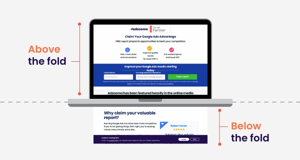
Once the technical, broken aspects of the page or site have been fixed, you want to look at making improvements to the page to help the user feel comfortable, and understand that they have found the correct information and are in the right place for what they need. Speak to your design team about any improvements that back be made above the “fold” of your page.
This is the area that loads first and that most users will see. Incorporate video into the area above the fold, or use animation to capture the users’ attention. You can also use different scrolling methods to make the page more interesting for users.
- Improve the speed of your site
It’s essential to ensure your site has a fast load speed so that users find what they need quickly. Studies have shown that online shoppers will abandon a cart on a site that takes too long to load, so this is especially important if you have an eCommerce site.
Slow loading speeds can be combatted with lazy load options for images, less reliance on video content, and improving your website’s host. Check out our handy guide to site speed optimisation for more information about how to carry out site speed checks and what steps to take to improve the speed of your site.
- Create Great, Readable Copy
Compelling copy will capture your users’ attention and let them know the information they need ahead of conversion. Encouraging the user to find out more about your products and services and giving them that information in a concise way will improve your site’s user experience and the conversion rate on your PPC landing page.
In addition to having compelling copy, you need to make sure it’s readable. Website readability measures how easy a user can read and understand the content on the page. The higher your readability score, the better. There are some great tools out there, such as Readable, that measure your score based on sentence complexity, sentiment, style, tone and personalism.
Image source: Readable.com, May 2022
- Re-Assess Your Contact Forms
The most important aspect is the contact form or checkout process on a PPC landing page. Without these features, you will not get any conversions, and your page is rendered useless. After testing that the form or checkout works, you should re-assess them regularly.
Can you make the forms simpler? Are you asking for too much information? Does the form look intimidating? Can you gather less information, so it doesn’t take as long to complete, then fill in the blanks later? Are all the fields correctly labelled with information regarding any special instructions for the field? Keep your form and checkout as simple as possible to increase your conversion rates.
- Test regularly
This isn’t a “make and forget” process. To get your PPC campaigns to deliver, you want to ensure the landing page they go to is working and engages users. Regularly test and refresh the page to improve its effectiveness and keep note of any changes and the response to these by using Google Analytics effectively.
Conclusion
It really is simple, the better your user experience is, the more likely a user is to convert. That conversion means your return on investment is improved, and your PPC campaigns benefit your business.
Take the time to improve the experience of your entire site, and not only will you improve conversion rates from new users finding the site through PPC ads, but you are also likely to generate more traffic from returning customers too.

