PPC campaigns tend to be challenging and risky. While preparing a campaign, you can only try to predict the result, while having to set the budget upfront and, of course, spend it.
That’s not so bad when everything goes well, but messing up anything could mean losing money (sometimes a lot of it), and having to deal with an angry manager/boss/accountant/reflection in the mirror (if the money was yours). Is there a way to get rid of the risk? Nope. Is there any way to minimize the risk? Yes, more than you’d want.
One of such ways is using landing pages for your PPC campaigns, but not just any landing pages – great ones. In this article, I’ll do my best to present you with 10 things to help you with creating a hell of a landing page (in a good way).
Here’s the list, so you can see if any of it seems smart enough to read on:
- Message Match
- Making a strong and relevant headline
- Talk to your audience, not to any audience
- How long is long enough?
- Landing pages and keywords
- Proving your point – reviews and case studies
- How to write CTA
- Everybody uses smartphones (so do your clients)
- Think about Things (and optimizing them)
- Make decisions based on analytics (when it’s possible)
Looks interesting? Nice, read along. Not really? Understandable, have a good day… unless you want to create a landing page for a PPC campaign that will help you get new clients.
Before we begin – a landing page builder
I’ve got a question for you (which you would have to answer yourself because I write here as a guest and I won’t get notified about new comments if they appear): do you have a tool for creating landing pages? If yes, go ahead to the next paragraph… unless you want to try a possibly better one.
Just so we’re clear – I work in Landingi. I honestly think it’s a great tool, but you might think it doesn’t mean much since I work there and they’re literally paying me to write for them (and lots of other stuff).
Before you can build a landing page, you need to have a landing page builder. Depending on your experience, needs, and budget, there are tons of options available. You might want to go with Landingi if you:
- Run your own business. Then I’d suggest the cheapest plan – Create – allowing you to build unlimited landing pages using 300+ templates and drive as much as 50,000 visitors per month.
- Work as a marketer. Then I’d consider the Automate plan, which provides more optimization options, such as A/B testing or heatmap-based PageInsider™.
- Represent an agency. Well, there’s the Agency plan, which features subaccounts, white-label options, priority support, and all the other things which make it great for marketing agencies.
10 Tips for Landing Pages in PPC Marketing
Let’s get to it!
Landing Pages and Keywords
In the beginning, there were keywords. Not in the beginning of it all, but certainly in the beginning of most PPC campaigns. I assume you already have a handful of them for your campaign. The key to keyword optimization on landing pages is including your keywords without swarming the page with them.
You’ve probably had the “pleasure” of reading poorly optimized, keyword-packed content causing an immediate urge to wash your eyes. Don’t do it to your readers – keywords are supposed to help to find your content, nothing else. Also, too many keywords may hurt your rating in Google and other search engines.
In short: use your keywords on a landing page, but do not overuse them. Make it something you would read.
Making a Strong and Relevant Headline
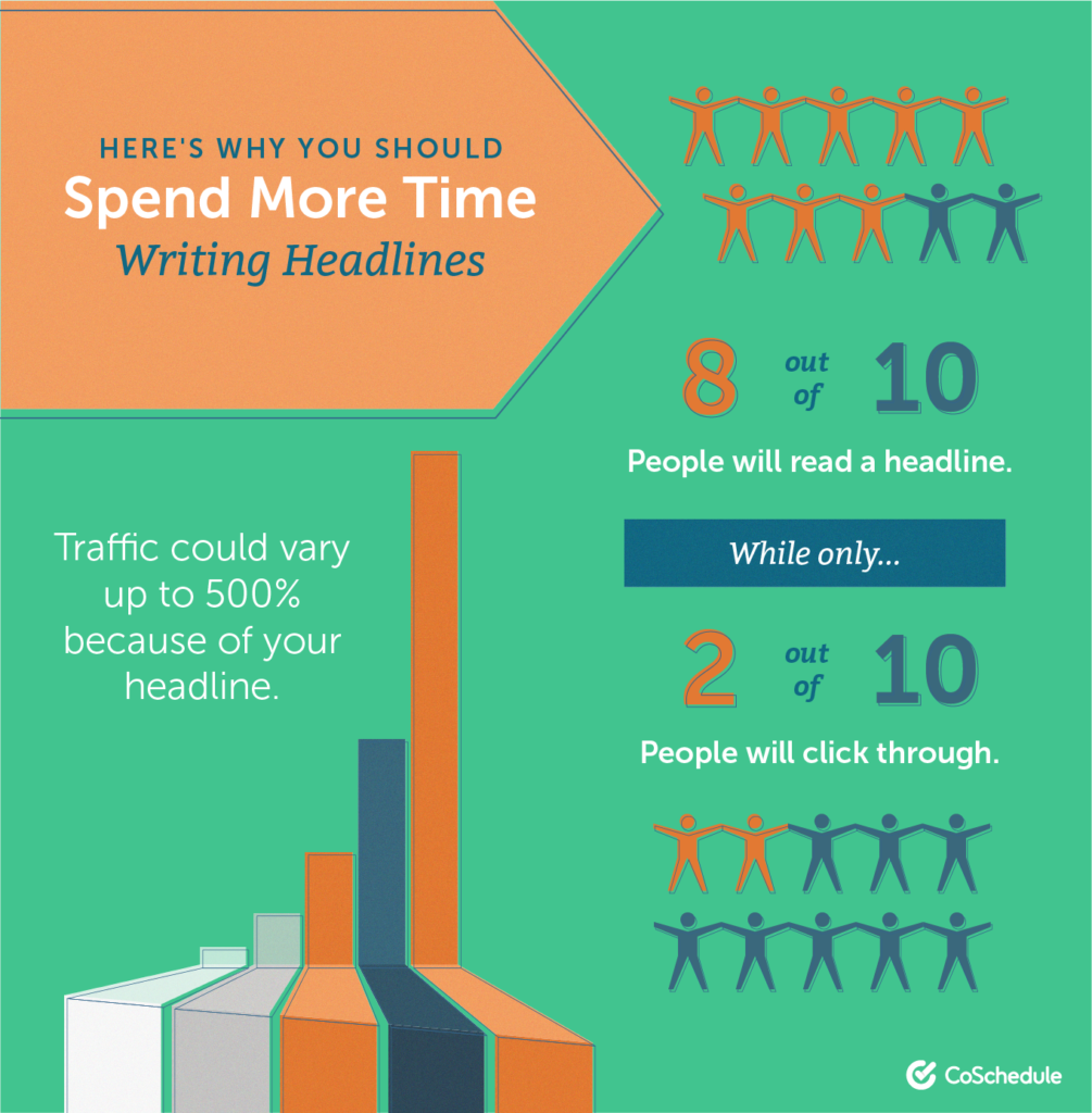
Next step: a headline. Every landing page has one, but good headlines are not so popular. I won’t waste your time convincing you that headlines are crucial. They are, let’s move on.
There are certain types of headlines that have a chance to convert well, depending on circumstances. The immortal “How to…” and lists of X ways to achieve Y, but in landing pages, things are not the same. First of all, you’ve got to keep your goal in mind. Do you want to convince visitors to join the online conference you’re organizing? Tell them how they would benefit from it.
The same goes for selling products or lead generation. Tell people what they will get if they click. Also, a little wordplay may help, but you’ve got to be careful with it.
A strong headline needs to be relevant to the offer. Say no more than what’s in your offer; overpromising can be a great bounce rate accelerator. That brings us to the next point, which is…
Message Match
So you want to get some paid traffic from search engines and you’ll be running ads optimized for certain keywords. Then the traffic will be channeled to a landing page. Sounds great, but you need to remember the most important rule: you’ve got to keep it matched. The message match is very often overlooked and underestimated.
Take a look at your web browser topbar – how many open tabs/windows you’ve got? To me, it’s usually around 15-20 – that’s the charm of multitasking. So, when I’m searching for something online, I tend to open a few links in new tabs, and then I get back to them.
Such an approach is why you need the copy on your landing page (starting with the headline) to be relevant to the copy you used in the advertisement. Think of it as a chain – the ad is the first link, while the landing page’s headline is a second one.
How to Write CTA
Generally, everything you write on a landing page matters, but not equally. While the headline is crucial, there’s a good chance that people will just skim the rest of the copy… laying their eyes on the CTA – Call to Action. Writing and designing a CTA cannot be underestimated, as it’s the decisive point of almost every landing page.
The CTA is usually placed on the button, where it’s much easier for visitors to spot it. Your job is to write an engaging call to action and create a button that stands out.
While creating a CTA, focus on:
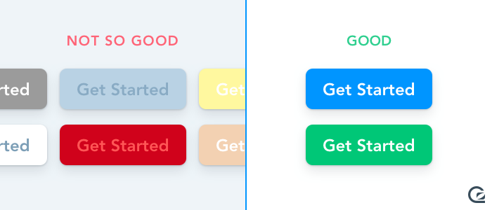
- Color and shape: use a contrasting color to make your button visible. Not sure which color to pick? Try Canva’s color wheel. Also, you may want to experiment with the shape of the button. Rectangular ones are the most popular, but you may want to round it up a bit and see what happens.
- Words: do what it takes to compress the CTA into 2-3 words, such as: Get the deal, Join now, Schedule a meeting or Use the discount. Your visitors have to be able to read the CTA instantly, it also has to be as simple as it gets since the decision-making often takes no more than a few seconds.
- Placement: think of your landing page as a canvas where – to achieve a desired result – you need to carefully place every element in the right spot. Finding these spots for CTAs is important, and may become easier with the heatmaps.
Talk to Your Audience, Not Any Audience
One of the most popular mistakes is trying to get your offer (and content) to everyone. Trying to reach as many people as possible generates enormous costs and results in poor conversions, because – let’s face it – there’s no product or service that’s interesting for each and everyone.
Build the copy on a landing page thinking about your specific target audience, and if you don’t have any – spend some time on it. Having the profile of your potential clients may turn out to be profitable in a long shot.
Proving Your Point – Reviews and Case Studies
Choosing a product or service online means checking dozens of factors – the price, functionality, but also reviews and opinions. And if that’s not one’s first day on the Internet, they probably know that a big chunk of opinions on the web are at least biased, if not simply fake.
That’s exactly why including reviews from “Jim, Scranton”, “Fabienne, Paris” or – God, forbid – “A happy customer” is of no use. Also: stock photos in reviews are just sad, don’t do that.
Make sure that you have a real (based, not biased) opinion to include on a landing page. Of course, it would be great, if it had have 5/5 stars, but sometimes adding a not-so-excited-about opinion may be just as good. As long as it’s real, proven by real name and a photo, if possible.
How Long is Long Enough?
There’s no strict rule to that, other than to keep it as short as you can. People aren’t used to reading a lot nowadays, especially on the Internet; they’d rather skim your landing page, instead of hanging on its copy.
Here’s an example layout of your landing page, made with sections that are often considered crucial:
- Opening (hero section) – the one with the headline, a graphic or video (make sure you’re using the right online video maker to make it beautiful), and an opening CTA.
Note: if your offer is simple and you don’t need big engagement from your customers (like when you just gather leads by giving away a free ebook), you may place the form in the hero section. It may seriously pump up conversion rate.
- Clarification (optional) – if you need to clarify the offer or the opening section wasn’t capacious enough to fit all the necessary information (since you don’t include all information on a landing page).
- Benefits/features – say (and show) what visitors will get if they decide to go with your offer.
- Reviews – include proof that your product/service works as advertised, let your customers do the talk. If you don’t have reviews yet, consider adding logos of companies you’ve had the pleasure of working with (especially if they’ve had the pleasure of working with you). If you’ve got none of these, just skip this section.
- The form/Final CTA – at the end of the landing page, there’s a place to close the deal. Add the form, which your visitors can fill in, and take your offer. Also, make sure the CTA you’re using here is the same as the one in the beginning.
Note: if your landing page gets longer than this, you may consider adding the third CTA, that redirects to the section with form, somewhere along the way.
Everybody Uses Smartphones (So Do Your Clients)
Responsive web design is a standard since half of web traffic comes from mobile devices. Not preparing your landing pages to work (and look) well on mobile means so much as cutting the number of potential visitors by half. Most landing page builders have the feature allowing to design mobile views of landing pages already implemented, so it’s a no-brainer.
Think about Things (and Optimize Them)
Having your landing page ready means you should publish it, but it’s certainly not the end of the journey. If you want to make sure you get the most out of it, you should observe it carefully and optimize it. There’s always something to improve!
- Optimize page speed – test your landing page in terms of speed here, and if you get a score lower than 90, consider including images in lower resolutions, cutting the videos (or avoiding autoplay), or giving up on animated elements and other fireworks.
- Optimize copy – A/B tests are made for trying out different headlines, CTAs and other parts of copy on your landing pages. Try a new headline and run a test for a certain amount of time or until they reach, let’s say, 1,000 visits each. Then compare the results, pick the winner, and… start another test.
Note: it’s hard to believe, but HubSpot’s study shows that merely 17% of marketers use A/B tests to optimize their pages. I’d recommend joining that 17%.
- Optimize layout – using heat maps can give you invaluable information – knowing where the visitors look and where they(‘re trying to) click means you can actually place the most crucial elements in such places.
Make Decisions Based on Data (When it’s Possible)
Some landing page builders include the essential tools to track conversions and visits, but they hardly ever go beyond that. While working on PPC marketing campaigns, you’ll probably need more data so that you can base your next moves on solid foundations instead of a hunch.
To prepare a PPC campaign, you might make use of some powerful yet easily accessible tools. I’m thinking of Adzooma (to find suitable keywords and optimize campaigns), Google Ads Editor (to create and edit your PPC creations), or the aforementioned Landingi (to create landing pages for your campaigns). Don’t forget to check your results in Google Analytics to plan the next steps in the optimization process.
Embark on a PPC Journey
After all, paid marketing campaigns can be compared to adventures. Risky? Yes, but also fun and potentially very successful.
As for takeaways: working hard before launching the campaign pays off, so don’t hesitate to think it over a few times using this checklist. I wish you nothing but successful campaigns and I hope this helps.

