With the biggest number of active users across any social network, it’s not a surprise that Facebook is one of the best social media platforms for businesses to advertise on.
Using Facebook for social media marketing and advertising is brilliant for expanding your reach, raising awareness of your business and getting more potential customers into your funnel.
One way to maximise the success of your Facebook campaigns is to capture email addresses from potential customers that have seen and engaged with your content on Facebook. The way to do this is through Facebook squeeze pages.
This guide will tell you how Facebook squeeze pages work and how you can create one.
What is a squeeze page?
A squeeze page is a type of landing page designed to get email addresses from customers.
It’s a single page that users are taken to after they click on or engage with an advert.
Imagine your ad is a sponge and Facebook is a giant pool of water. When you post your ad, you absorb as much water as you possibly can. But you don’t want it to just sit there. You want the water in a particular bucket, so you take the sponge out and try to squeeze every last drop in.
This is what a squeeze page does. It’s where people go after they click on an ad and is designed to try and get as many users as possible to provide their email address for a great reward.

What’s the difference between a landing page and a squeeze page?
Honestly, there’s not much difference in terms of the purpose. Both a landing page and Facebook squeeze pages are what users land on after interacting with an ad.
The main difference between a landing page and Facebook squeeze page is that landing pages can be built for different goals, while a squeeze page only has one: collect an email address.
Facebook squeeze pages are also different from landing pages because they’re designed for your Facebook users. This means that they’re designed to match the original Facebook ad – and will adhere to the landing page requirements that are outlined by Facebook.
What are Facebook’s policies on squeeze page?
As Facebook outlines in its Advertising Policies, all landing or squeeze pages that you create needs to:
- Be easy to navigate and use
- Provide relevant information upfront
- Include your privacy policy
- Be similar in style to your ad and website branding
- Be easy to exit – don’t try to hide the exit button or include pop-ups that make it difficult for users to leave
- Avoid excessive pop-up ads
- Avoid any attempts to bait or deceive the audience
- Avoid sexual or shocking imagery or content
- Avoid auto-play or download
Generally, Facebook policies are all about being honest and not trying to deceive users in any way. It’s solid advice to adopt for all businesses.
Who are Facebook squeeze pages best for?
Squeeze pages are great for businesses who are looking to capture emails. That’s the entire point of a squeeze page after all.
Generally, this tactic is more suited to those who want to drive awareness and consideration of your brand. It’s for the earlier stages of your funnel, where you potential customers aren’t ready to buy yet but can be brought into further campaigns.
When you have captured the emails, you can implement these users into an email campaign or use them to create a customer match list to target with the next stage of your advertising campaign.
Top tips to create a squeeze page
First and foremost, you need to know how to create Facebook campaigns. Okay, now that point has been covered, let’s talk about what makes a good squeeze page.
1. Use a strong headline
Headlines are what grab the attention and courage others to read on. It’s one of the most important parts of any page.
And when you remember that you only have approximately 10-15 seconds to make a good impression when someone lands on this page, you need to make sure that the headline is a good one. No pressure, of course.
This doesn’t mean that you need to reinvent the wheel with truly amazing headlines. It means that to get a high converting page, your headline needs to give your visitors the jist of what this page is and why they should care.
Imagine that you only have 10 seconds to tell someone why they should give you their email. Think about the best reason you have for them signing up, then write it down into a headline. 9 times out of 10, it’s your winner.
2. Offer something your customers want
No one gives out their email for nothing.
There needs to be something that users will want from you in order to give their email as an exchange. This could be anything, such as:
- Free resources, such as an ebook or download
- Being the first to know about an event
- Getting an exclusive discount code if they choose to shop with you
- A chance to win a prize in a competition
Whatever it is, it needs to be relevant to your audience and something that they are actually interested in. But, be wary of making it too grand. Everyone likes free stuff, but if the prize is too good to be true they may get suspicious and decide to leave.
Thinking about doing a giveaway? Find out the pros, cons of hosting giveaways and the top tips of social media giveaways here.

3. Include a strong CTA
The point of a Facebook Squeeze page is to get people to enter their email addresses. So, you need a strong CTA (call to action) to tell them to do that exact thing.
Without a great CTA, some users won’t take the next step. CTAs are a strong, yet engaging command that pushes them into taking action.
For the best results, they need to be direct and to the point. CTAs are not a time to be soft and to politely ask. If you frame it as a question, people will say no. If it’s a command, they’ll take action.
For squeeze pages, example CTAs could be:
- Enter your details
- Enter your email
- Sign up today
- Enter the competition
- Get your free thing!
Whatever you choose, make sure it’s strong, snappy and matches your brand.
4. Easy to use and look at
The beauty of successful squeeze pages is their simplicity. They have to be both simple to look at and easy to use, so you can guide users straight to the action you want them to take.
Take a look at this example from alcohol brand, Malibu (below):
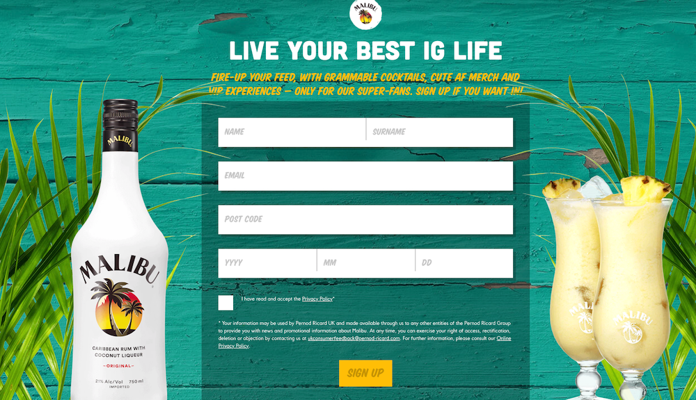
The sign up page is bright, colourful and simple and the focal point is the email form, which is the main purpose of the page. There’s no confusion about what the page is about or what action to take; everything is right there.
If you scroll down, you have on-brand pictures from their Instagram feed, with very clear navigation to informational pages like the privacy policy.
It’s both easy to use and look at, with a pretty strong CTA of “Sign up if you want in!”.
5. Keep it short & snappy
There’s a famous marketing quote that says “there’s no such thing as long copy, just boring copy”. It’s a nice sentiment that basically says that as long as you’re engaging your viewers with relevant information, your copy can never be too long.
That’s all well and true, but if you’re creating a squeeze page, you might want to quieten your inner writer and reign it back a bit. It’s all about goals. With a squeeze page, your goal is to get a visitors email address.
The more obstacles, copy and design you put in their way, the less likely they are to cross that finish line. So, keep it short, sweet and up for the job.
Keep an eye on the bigger picture
This guide has given you tips on creating your own Facebook squeeze page, but it’s always worth remembering that this is just a small part of your overall marketing strategy.
Whatever you do on this page needs to marry up with your Facebook campaigns, social strategy and corresponding email campaign. If one of these points is weak, the whole journey can suffer.
Want more advice on how to maximise your Facebook campaigns? Take a look at these 44 practical Facebook marketing tips here.


