Do you want to succeed in the online world? If so, you need a website. But creating an effective website design is more complex than it seems. The process requires careful planning and consideration of many factors for successful outcomes. Read on to find out how to create an effective website design.
Do you understand your target audience?
Before you can begin creating a website, it is vital to understand who your target audience is. Who are they? What do they want from the website? How can you reach them, and how often do they expect updates from you? And most importantly, how can you make their lives easier by helping them solve those problems with your product or service?
Knowing all this information will help guide the decisions that go into designing a site for them, including colour palette choices, layout structure and navigation flow.
Set up an effective site structure
Site structure is the way your site is organised. The structure of your website is essential because it helps visitors understand how they can find the information they are looking for and make sense of all that is on display.
A good site structure makes it easy to tell which content belongs together and where each piece sits within the hierarchy of other pages on your website. It also ensures that each page contains everything it needs in terms of text and images so that users stay focused and clear of empty spaces or missing pieces of information.
How to leverage colour psychology?
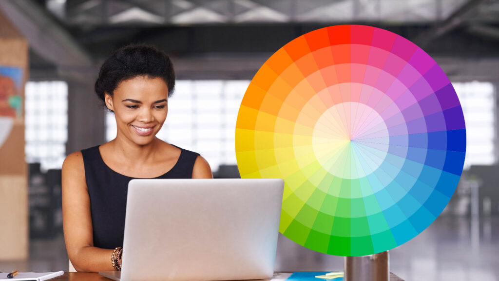
Colour psychology is a powerful tool for creating a positive mood and establishing trust. You can use colour to help create a visual hierarchy, making it easier for your visitors to navigate your site. Colours also have connotations that can be used with other design elements to evoke feelings of urgency or authority. Use red to connotate passion or yellow to make your reader smile.
Need some tips for designing a user-friendly website?
Here are some of our tips on how to create a user-friendly site:
Use a user-friendly navigation bar.
Ensure your text stands out from the content shown on your pages. This can create a difficult experience for your readers. Similarly, make sure your site is easy to read. Do not use fancy fonts that are difficult to read or small text that is hard on the eyes.
Make sure your site loads quickly. Slow load times can frustrate users and cause them to leave before they have had time to look around. This article might help.
Include links on your page to relevant information and highlight these in a standout colour or font.

The role of mobile-responsive design in today’s digital world
The term “mobile-responsive design” (MRD) means that when someone visits your website on their phone or tablet, it will automatically adjust its layout to fit the screen size of their device.
Mobile-responsive design now plays a huge part in society. In today’s digital world, mobile is becoming the dominant platform, so take importance in your role to design a mobile-friendly website. If you fail, your users will leave and never return because of their bad experiences on your site – and there is plenty of competition ready to take all of that away from you if you cannot live up to the standard.
MRD is a way to make your website look good on any device. This is important because most people now access the internet through their smartphones, and if your site is not mobile-friendly, they could get frustrated and leave before they even see all of your fantastic content.
Common mistakes to avoid when designing a website
Try to use only a few graphics. Graphics are great for conveying your message, but they can also distract and take up valuable space on a page. Keep it simple if you want people to read through your content without getting distracted by flashy images.
Similarly, avoid too many colours in your design, especially if they are bright or neon-coloured.
Finally, be careful to use fonts sparingly, even though there are thousands out there! Suppose every word on each page has a unique font style and size. In that case, readers will need clarification about what information is important versus unimportant, which makes them feel overwhelmed.
We hope this article has given you some insights into creating a more effective website design. As we’ve seen, many factors are involved in creating a successful site, from understanding your audience and their needs to using colour psychology to influence their emotions. But if there is one thing we can all agree on regarding web design, it’s that simplicity is key!
For more advice and services, visit Adzooma today!

