Conversion pain points are the points where your customers encounter a problem during the conversion journey. If the problem isn’t solved, it will stop them from converting.
Let me be blunt here. Pain points are killing your conversions, which mean fewer sales and less profits. If you don’t identify these pain points, you’re going to continue losing conversions.
Ready to do something about it?
Read on to find out how to identify your pain points, the most common reasons customers might not be converting and how to fix these problems.
How to identify your pain points
To identify your conversion pain points, you need to set up tracking and analytics for your website. Without this data, it will be impossible to pinpoint exactly where your customers are dropping off and where you need to focus your attention on.
If you’re not already using Google Analytics, this is the first place to start as it gives you data such as:
- Who is visiting your site
- Which pages people are looking at
- Where people are leaving your site
- How long people are spending on your site
- And much more
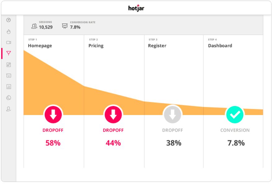
Programs like Hotjar are also incredibly useful here, as they literally show you what your users are doing on your page. You can see where they click, which bits they spend the longest on and how they scroll through the page.
This allows you to literally see where people are stuck on your website, showing your conversion pain points first hand.
Ask your customers
Looking at the data is always the first step to identifying your conversion pain points. But if you’re still not sure what it is that is preventing your customers from converting, you can always ask them.
Setting up a survey is a good way to get feedback directly from your customers and getting them to tell you what they don’t like, what’s stopping them from buying and what you can do better.
These surveys can be triggered when users go to exit your site, meaning you can literally stop someone who hasn’t converted and find out why.
Test new changes
Once you’ve identified where your customers are dropping off, it’s not good enough to just guess the reason why and mark the situation as fixed.
Any changes that you make need to be tested. It’s how you can see if what you’re doing has made a difference, or if there’s something else that’s causing customers to drop off.
Split testing (or A/B testing) is a way of testing these changes against the original version. When visitors come onto your site, they’ll be shown either the old or new page to see which of them perform better.
VWO has written a guide on split testing which you should definitely check out.
Common pain points and how to fix them
When it comes to conversions, there isn’t really a perfect formula. It’s about seeing where your customers stumble and doing everything you can to make the conversion journey as smooth as possible for them.
Most of it relies on using your own data and testing changes to see if they improve your conversion rate.
However, there are a few common pitfalls that your website might be falling into. To make sure you’re not suffering from them, we’ve listed some of the most common conversion pain points that you need to keep an eye on and how to fix them.
1. Not enough information
85% of people research a product online before making a purchase.
The internet is not always a good place. For every business, there’s another fake website and scam that can offer similar items to yours. Before making a purchase, your customers need to know that you’re selling the real thing.
Even if people trust your company, they’ll want to know that your product is the best place to buy it online. If they can’t get the details they need, they’ll go somewhere else.
The good thing about this conversion pain point is that it’s an easy one to fix. Just make sure you’re including the information that your customers will need. This can include:
- Product dimensions or sizing
- Product images
- Testimonials and reviews from other customers
- Materials/ingredients
- Return information
- Guarantees/warranty information
Reviews and testimonials shouldn’t be ignored here. They are a fantastic way of building trust and easing any lingering doubts about your product that customers will have.
2. Too many checkout stages
Cart abandonment is a real issue in eCommerce. For some industries, the cart abandonment rate is as high as 75%.
One of the biggest reasons for cart abandonment is a complicated checkout process. No one wants to jump through several hoops just to buy one item. The longer and more complicated a checkout process is, the more chances you’ve giving your customers to turn away.
Thankfully, checkout customization is one of the key features that leading website builder solutions offer, as blogger Kaleigh Moore points out.
The checkout process should be as streamlined as possible. Take a look at Amazon’s checkout as inspiration. Their checkout is easy, simple and has very little steps involved. Even better, if you’ve got your information saved you can buy it in a single click. That’s efficient.
If you don’t have a guest checkout option, this might be the first stage. Having an account with a company is great if you know you’re definitely going to be coming back. But if this is a one-time purchase, it’s a hassle creating passwords and submitting all your information for this.
Not everyone wants to give this information over. They just want to pay and go. Not giving them this option is just inviting them to buy elsewhere.

3. Slow page speed
Slow page loading times may seem like a little annoyance, but they can literally kill your sales. Each year, slow-loading websites cost retailers $2.6 billion in lost sales.
Your users are impatient and expect your website to load instantaneously. In fact, 47% of users expect a maximum of 2 seconds to load a website. 2 seconds. Wow.
If your page takes too long to load, people will leave. That means you’re losing people before they’ve even had a chance.
You can use tools like Google’s PageSpeed Insights to test the speed of your page and see what is slowing your website down.
If you’re an Adzooma customer, we’ll automatically check the site speed of all your landing pages to keep an eye out for this conversion pain point.
4. No upfront pricing
In a study about cart abandonment, the biggest reason that people abandoned their carts is because of extra costs such as shipping, taxes or fees being too high.
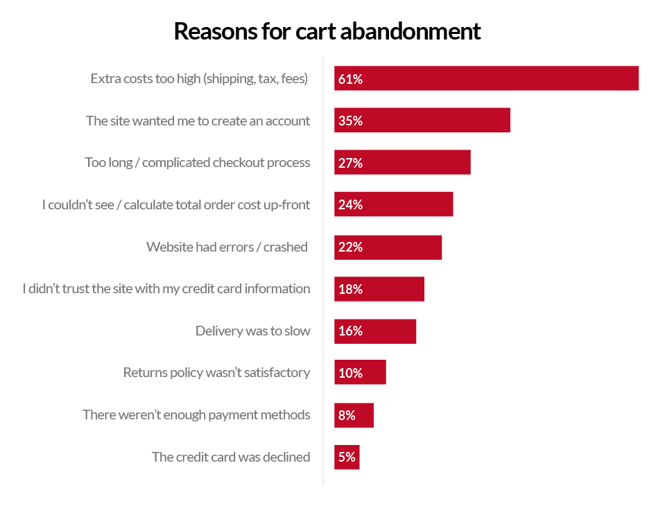
I’ve been there before. One time, I found a perfect notebook that would make an excellent present for my writer friend. I was sold and went straight to checkout. But, after entering all my details I found out that shipping cost more than the item itself, leading to a very speedy exit there. This perfect item was no longer worth it for me because of hidden costs.
Although you might not be able to lower these fees, one way to counter the drop off in customers is to be transparent and open about these prices from the very beginning.
When researching your product, your customers want to know exactly how much it will cost them. They shouldn’t have to go through the entire checkout process just to get an estimate on shipping and taxes.
So, include messaging about these costs on your website. There are some apps that will allow users to enter their postcode and calculate shipping costs on the page, helping to cut your cart abandonment rate.
That’s not the end
Increasing your conversions is never a one-time fix. It’s a continuous cycle of optimisations and fixes to keep beating your personal best and get the best conversion rate for your business.
There are countless CRO tools that you can use to help you with this. But if you’re lacking the time to learn and implement all these changes, you can always trust a local agency to help.
At Adzooma, we’ve got the perfect place for you to find them.
Our Marketplace is an independent directory of agencies ready to help your business. Just search for the service you need to see your next agency or freelancer in the list.


