If you want to boost your conversions and keep people on your site for longer, you’ve come to the right place.
We’ve got all the tips and tricks you need to improve your landing page – and not just by adding images and videos. We’re talking about instilling trust, creating a captivating mobile-first design, and carrying out insightful A/B split testing.
Let’s get straight to it.
What is landing page experience?
Landing page experience is a measurement used by search engines, such as Google, to determine how well your landing page serves its users. The higher the quality and relevance of your landing page, the better your experience.
Your landing page experience also affects your Quality Score and Ad Rank, a metric used to calculate your CPC (cost-per-click) and your position on the SERPs (search engine results page). A landing page that offers poor user experience might show less often than others or potentially not at all.
There are several steps you can take to make improvements, but there is one core factor:
Your ad + landing page = A clear and consistent message
There is no point in creating a landing page if it isn’t going to sell what you’re talking about in your ad. Users will click through, be instantly turned off and click the big X in the corner of their screen.
You want to make a clear connection between the two and promote the same message and benefits throughout. It might sound obvious, but aligning this sort of content has been known to increase conversion rates by up to 212.74%.
6 ways to provide a better landing page experience
Now you know the first principle to improving your experience, it’s time to look at the 6 remaining steps. These are just as important as the first one and should be used together to boost your Ad Rank.
1. Use original and engaging content
For every landing page you create, you want new and exciting content.
Regurgitating the same information over and over again will take value away from each of your products and services. If you have PPC ads running for mattresses, the corresponding landing pages should focus on those specific benefits only.
Talk about your lifetime guarantee, the excellent range of sizes, and the limited offers and bundles you have. Promoting bed frames? Keep it targeted and avoid talking about the rest of your business. If you’ve got specific testimonials, use them on this page for more impact.
Localisation is also a great way to personalise your landing pages, even with simple things like swapping out images and taglines. Something like “The best mattress supplier in Nottingham” works.
2. Make your USP loud and clear
You don’t want someone to get to the end of your page and think “ahh! That’s an amazing feature”. Because the truth is, they might never make it there.
55% of viewers will spend less than 15 seconds on your site. If you don’t tell them your USP straight away, they won’t even hang around for that long. Especially if you’ve given them a teaser in your ad. Here’s our USP at Adzooma:
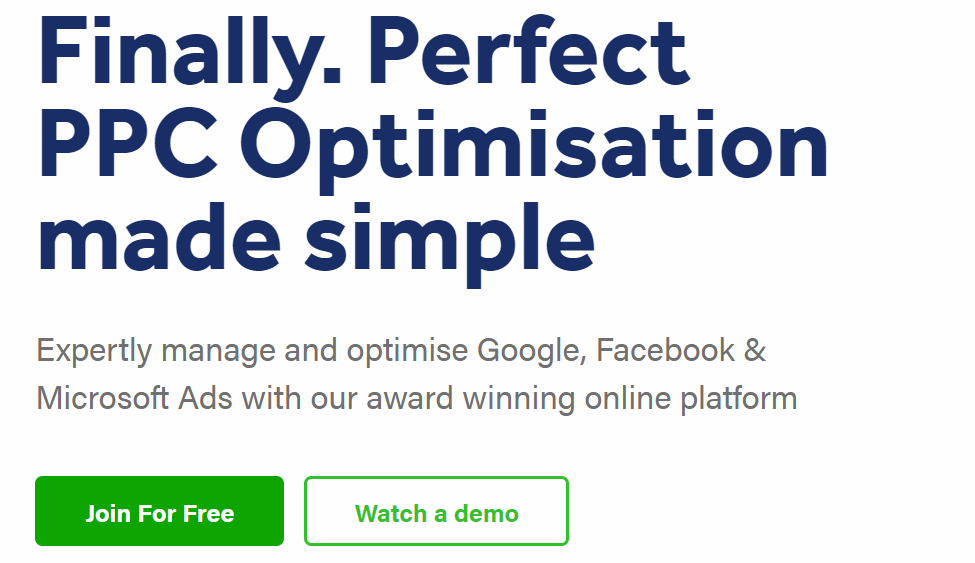
It shows exactly what our platform does, attracting users who are looking for an easy-to-use PPC management platform. What do you offer that no one else does? Even if it’s a popular service like hairdressing, what makes you different? 2,000 happy customers? Rated top-10 in your industry?
These are all things that count towards more conversions, and things you should shout about at the top of your landing page.
3. Instil trust
Highlighting positive testimonials at the top of your landing page is an excellent way of reassuring your customers and convincing them to continue browsing. It will also save them from searching for reviews on your page, giving them more time to consider a purchase.
There are 7 different types of testimonials you can use, each one personalised for your specific product or service. Whether it’s a customer video, user-generated content or a simple quote online, these elements could help you generate approximately 62% more revenue.
Using testimonials alongside more expensive items? This could boost your conversions by up to 380%. But, you don’t want to forget about the basics.
Making your contact information clear and easy to find will show potential customers you’re accessible and improve their landing page experience.
4. Focus on page speed
If you underestimate this one, your landing page will be set up for failure.
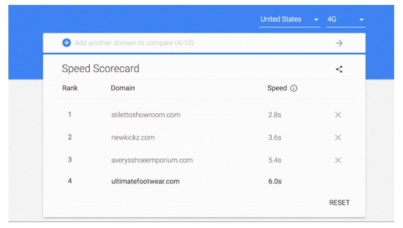
And it doesn’t matter how good your product is. In fact, mobile sites that load in 5 seconds earn up to 2x more ad revenue than those whose sites load in 19 seconds. If that isn’t enough, 53% of visits are likely to be abandoned if pages take longer than 3 seconds to load.
Plus, the speed of your landing page makes a difference to Google. The search engine changed the way it calculates mobile speed last year, meaning your score will be generated faster and there won’t be anywhere for you to hide.
To help you make as many improvements as possible, tools like Google’s Speed Scorecard and Impact Calculator will show data for your current page speed.
5. Create a mobile-first design
The majority of people search on mobile worldwide.
If they experience a bad mobile experience, 46% of these users wouldn’t consider the same brand again. Better yet, 60% of consumers won’t purchase from a brand with poorly written content, overly personalised content, or content that isn’t optimised for mobile.
They’re features that make landing pages too difficult to navigate and instantly put people off.
The solution is simple. Use Google Analytics to find out how users access your site and make a note for future reference. Even if it’s a small percentage, design for mobile first. This will help you to prioritise certain features and get key points right before making adjustments for desktop.
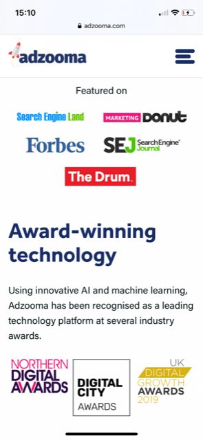
See how your form fits, analyse the overall layout of the page and check that nothing is broken or missing. Load it on Apple and Android for extra clarity, ensuring all of your sections are seamless and intact. Here’s ours for reference:
Read: How To Optimise Your PPC Campaigns for Mobile
6. Split test
When everything else is complete, split testing is the icing on the cake.
It’s essentially a way of finding which elements perform the best and pulling them together to create a finalised, unbeatable page. You can test few or many features on your page, but analysing common research can be the most efficient.
For example, 46% of marketers believe that form layout has a big impact on conversion rates, which could be anything from including an image to the number of fields you use. So, if you ask for 4 pieces of information and get less responses, testing it against something more simple might give you better results.
Similarly, if CTAs such as “tell me more” and “submit your enquiry” aren’t really working for you, HubSpot suggests that personalised CTAs perform 202% better. Other elements you can test include the colour of buttons, your content style and length, and images and videos, and you can also tweak which features sit above and below the fold.
Always appeal to the user Optimising for conversions only isn’t going to get you far. You need to optimise for your exact customers, showing them the relevant testimonials and benefits that will capture their attention and answer any questions.
Search for your competitors, get inspiration from what they’re doing well and apply similar techniques to your own pages. If you want a super-strong landing page experience, following our 6 tips can help you get there.
Or, if you don’t want to do it yourself, Adzooma Marketplace can find the right agency to do it for you.

