TL;DR
- Colour is a fundamental of psychological marketing.
- Up to 90% of impulse decisions are based on the colour of a product.
- Digital marketing doesn’t have a dominant colour – everyone is battling to be different.
Colour influences so much of our decision-making that it’s impossible to ignore. It’s as important as the words we choose, the images, the message we’re trying to get across, everything. The colour you choose says a lot about your brand – whether you like it or not.
In fact, up to 90% of impulse decisions are based on the colour of a product.
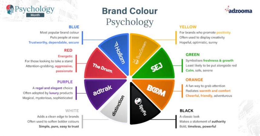
What your brand colour says about you
Everyone already knows the basics:
- Red is danger ????
- Green is nature ????
- Yellow is happy ????
You don’t get through life without being bombarded with colour. The most popular brand colour worldwide is blue, with over 30% of brands choosing it as their dominant colour (guilty.)
In the digital marketing industry, there’s not a dominant colour. Agencies seem to choose colours from the entire rainbow to best represent their brand. From a creative industry, you would expect nothing less. Other professions tend to have associated colours: healthcare, for instance, always wants to present a clean and sanitary feel, so white is often a common choice (the NHS, for example, uses blue and white). Similarly, healthy food stores favour green as it’s synonymous with nature – you get the picture.
Did you know: In the Mediterranean, blue is the colour used for amulets known as nazar that protect wearers from the “evil eye“.
In digital marketing, we don’t really have that same message that we must get across. We all have our own products and purposes, and all go about it in different ways. You can see this in the fact we cover the entire colour wheel with our brands. In a saturated market, where we strive to show we’re different, colour is our first point of call. It reminds our audiences of what our brands stand for long after our advertising has left their minds.